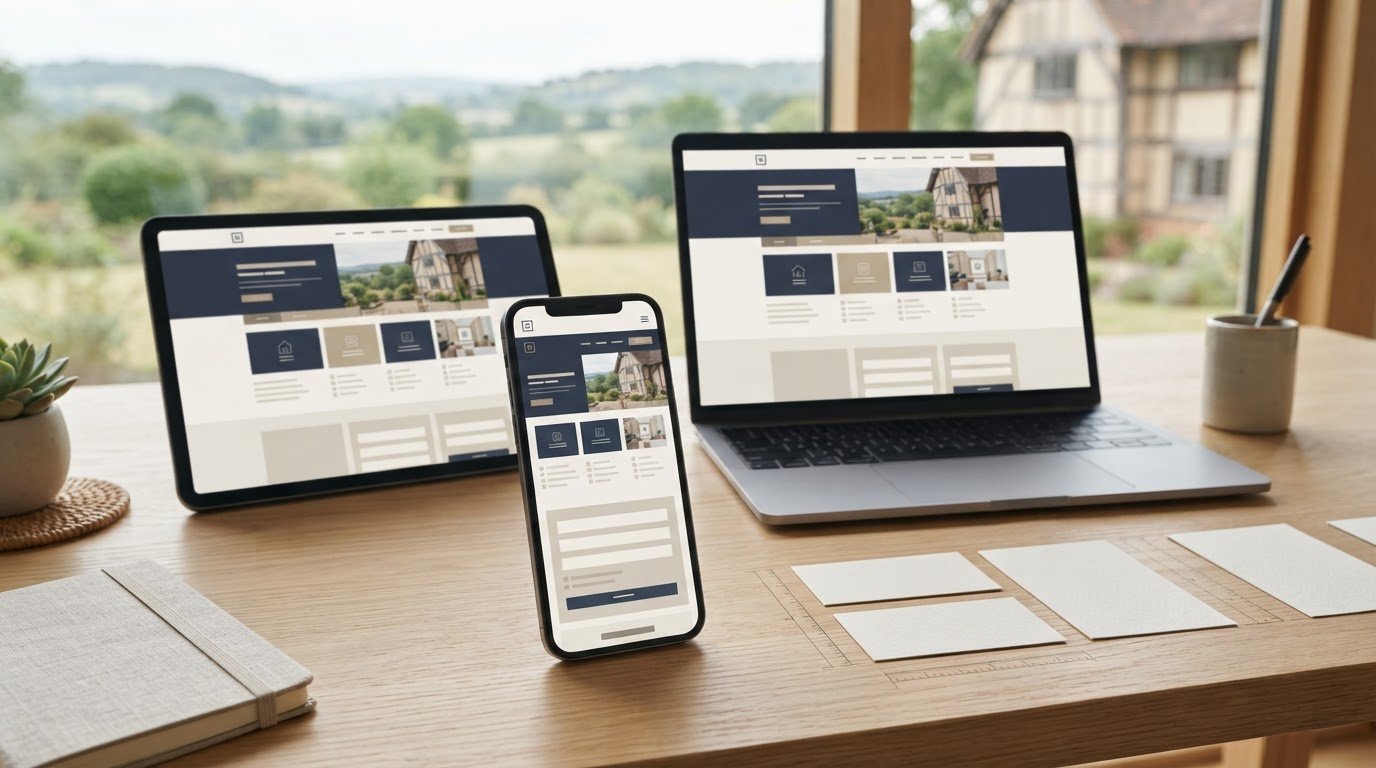
A mobile-friendly website needs to work smoothly on a phone, not simply shrink to fit its screen. The cost of mobile-friendly website design in Bromsgrove depends on the project’s features, content and complexity, with a price provided after a quote request. Responsive layouts, clear navigation and easy-to-use forms all shape the work involved.
It’s sensible to weigh the budget carefully, especially when you want a site that looks polished and helps customers take action on any device. This guide explains what responsive design includes, which project details influence cost and what to consider when planning a new or updated website. You’ll also see how to assess the practical fit for your business, from a straightforward brochure site to an online shop, so you can make a clear, confident decision.
Key Takeaways
- Plan one responsive site that adapts its layout to different screens, rather than separate desktop and mobile versions.
- Prioritise readable content, clear navigation and easy-to-use forms so visitors can complete key tasks on a phone.
- Define the pages, features and content you need before requesting a quote, as project scope shapes the work involved.
- Choose the right website format for your goals, whether you need a business site, an online shop, a landing page or a charity website.
Responsive, mobile-friendly website design
Responsive design adapts one website to mobile, desktop and tablet screens. For a Bromsgrove business, check that visitors can complete the same key tasks across devices.
Mobile, desktop and tablet layouts
A developer should make page content, navigation and forms adjust to the available screen space. Compare the same page on a phone, tablet and desktop: check that headings remain readable, menus are easy to use, and buttons are not crowded. A mobile-first approach starts with the smallest screen, then builds out wider layouts. Ask to see a working example, such as a product page with clear images and an accessible basket.
When choosing a Bromsgrove web designer, compare responsive examples, the design process and how testing covers real visitor tasks. Look for agencies that explicitly describe mobile-first design, then inspect their live work on your own phone and tablet.
Mobile-friendliness checks
Test a website on a phone, not just in a desktop preview. Open key pages, rotate the screen, follow the navigation and complete a form. Check that text fits without sideways scrolling, links are easy to tap and important information is easy to find. For an online shop, try selecting a product and completing the checkout. These steps can reveal problems that a static screenshot hides.
Responsive pages keep content consistent across devices, while separate mobile and desktop sites can create duplicate or inconsistent content that may harm search engine visibility. Mobile usability supports a clear visitor experience, but it cannot guarantee Google rankings or visibility in searches for nearby businesses. Common problems include tiny text, crowded buttons, slow-loading pages and checkout steps that are awkward on a phone.
A standard brochure website usually takes two to four weeks from sign-off to launch. Bromsgrove web designers also provide ongoing website assistance and maintenance, helping businesses address issues as pages and content change.
Mobile-friendly website design
Mobile-friendly design starts with the needs of people using phones. Set the main task first, such as finding a service, booking an appointment or browsing products. Then shape the page content around that action instead of squeezing every desktop element onto a smaller screen.
A bespoke design can reflect your brand and prioritise the features your customers use. For a local business, that might mean placing service information and contact details prominently. For an online shop, it could mean making products and essential buying information easy to find. The right scope depends on the purpose of the site.
Affordable design is about matching the work to your actual needs, not cutting useful features by default. The price depends on the project and is given after a quote request. Page numbers, bespoke features, content preparation and integrations all affect the work involved. Include hosting in your overall budget and understand its renewal terms before committing.
Before requesting a quote, list the pages you need, the actions visitors should take and any tools the site must connect with. Separate essential launch features from ideas that can wait. For example, a service business could start with clear service pages and an enquiry form, then add functionality as its needs develop.
Use this brief to compare proposed scope and understand what each design decision delivers. If you’re planning a new or redesigned site, discuss your website requirements and the features that matter most to your visitors.
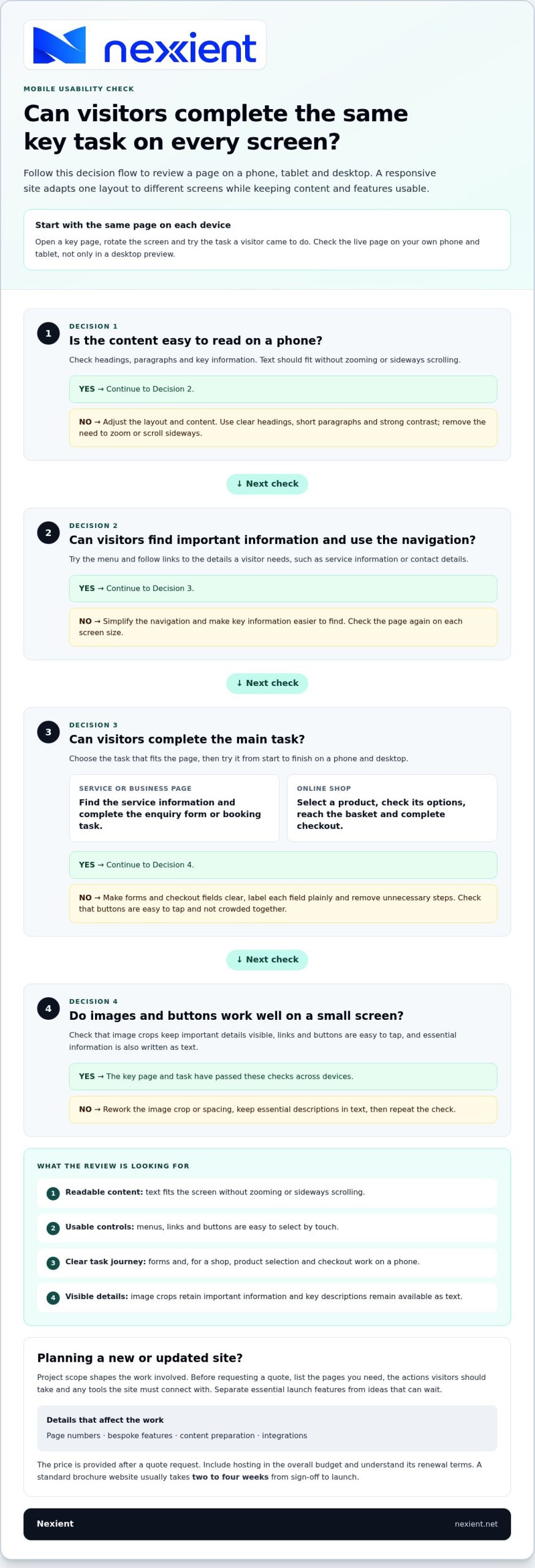
What makes a website mobile-friendly and responsive?
A responsive website adapts its layout while keeping content and features usable. For example, a three-column service grid can become a single vertical list on a phone. This keeps each service visible without making visitors scan across the screen. The design should also preserve the order of information, so contact details and key actions remain easy to find.
Readable content involves more than fitting words onto a small screen. Use short paragraphs, clear headings and strong contrast between text and background. A service page, for instance, should make its main benefit and enquiry option easy to spot. Buttons need enough space around them to reduce accidental taps, especially beside other links.
- Check that page text stays legible without zooming.
- Make menus, links and buttons easy to select by touch.
- Review image crops so important details remain visible.
Images should support the message, not push useful details out of view. A restaurant’s menu photo, for example, needs to show the dish clearly on a narrow screen. Keep decorative images secondary and put essential descriptions in text. This helps visitors understand the offer even if an image fails to load.
For an online shop, test the journey from product page to basket. Product options, delivery information and checkout fields should remain clear on a phone. Remove unnecessary steps and label each field plainly. Then repeat the same task on desktop to catch layout issues across screen sizes.
Use these checks when reviewing a new design or improving an existing site. Discuss your responsive website requirements and the tasks visitors need to complete.
Nexient: Business Websites
Nexient creates websites for businesses that need a clear, practical experience across mobile and desktop screens. If your current site is difficult to use on a phone, or you’re planning a new one, a business website can be shaped around your content, goals and customer journey.
Choose the format that fits the task: an eCommerce Website for online sales, a Landing Page for a focused campaign, or a Charity Website to explain your work and guide supporters. Before starting, outline the pages visitors need, the actions they should take and the mobile features that matter most. This gives the project a useful direction from the outset.
To discuss a website that works well for your visitors, contact Nexient.
Turn your website plans into a clear next step
Think beyond launch: your website should support the next stage of your business, not only today’s priorities. Before planning mobile-friendly website design in Bromsgrove, write down the outcome you want, the visitors you need to reach and what you want them to do. This gives your project a practical starting point and helps focus decisions about content and features.
Nexient designs Business Websites, eCommerce Websites and Landing Pages to suit different goals, from explaining your services to selling online or supporting a focused campaign. Share your priorities and the tasks visitors need to complete, then use that brief to shape the right direction for your site.
Contact Nexient about your website to discuss your plans and take the next step with confidence.
Frequently Asked Questions
How much does web design cost in Bromsgrove?
The cost depends on the project’s scope, including the number of pages, bespoke features, content requirements and connections to other tools or services. An online shop, for example, needs product and checkout functions that a simple service website may not require. For a Bromsgrove business, the useful first step is to list essential pages and features. A tailored price is provided after a quote request.
What are key factors for the design phase?
Start with your business goals, intended visitors and the actions you want them to take. A Worcestershire tradesperson might prioritise service details and enquiries, while a retailer may need product categories and purchasing information. Gather your text, images and brand assets, then agree which pages matter most. Clear priorities help guide design choices and keep feedback focused.
How much does mobile-friendly website design cost in Bromsgrove?
The cost of mobile-friendly website design in Bromsgrove depends on the website’s scope, including its pages, content and required functions. A mobile layout may need extra attention for forms, product displays or booking steps, depending on the visitor journey. Set out the tasks people should complete on a phone, then request a quote based on those requirements.
What should a mobile-friendly website design package include?
Compare packages by their design, mobile-responsive layouts, page scope, revisions and launch work. Nexient’s packages include features such as SEO setup, SSL and security, analytics and contact forms, with inclusions varying by package. For an online shop, check the listed product, basket and checkout features. Hosting and ongoing maintenance are also available from Nexient.