
A polished landing page can still fail to turn interest into action. Creating a high-converting landing page isn’t simply a matter of choosing a striking layout. It means connecting your campaign, message and next step so visitors know what to do and why it matters to them.
If you’re unsure what to include, how much to say or whether your design will generate enquiries or sign-ups, start by focusing on the visitor’s decision. A page needs more than good looks: it should feel relevant, explain the offer clearly and make the next action straightforward.
This guide takes you through a practical process for planning, writing and building a focused landing page. You’ll learn how to align it with your campaign, choose the right content and call to action, then measure results and make evidence-led improvements. The aim is a page that works as well as it looks.
Key Takeaways
- Before creating a high-converting landing page, define its audience, offer and one primary action.
- Arrange the headline, benefits, supporting proof and offer details in the order visitors need them.
- Use specific copy and make the next step easy to understand and complete.
- Track the action the page is designed to earn, consider where visitors come from and compare results with your own baseline.
Start creating a high-converting landing page with one clear campaign goal
A landing page focuses attention on one campaign action, such as requesting a quote or signing up for an event. Unlike a homepage, which helps visitors explore different parts of a business, it gives a specific audience a direct route to a relevant offer. This overview of landing pages provides useful background on their role in lead generation and conversion.
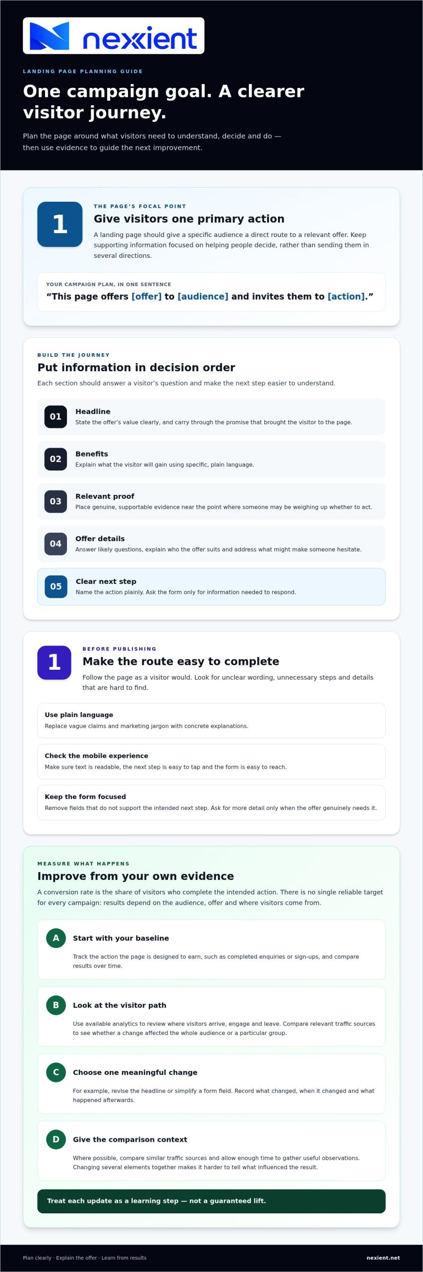
Start with the campaign, not the colour palette. Before design begins, write down who the page is for, what you’re offering and the single action you want visitors to take. Then review the message that brought them to the page, whether it came from an email, advert or another campaign. Carry that promise into the headline and opening copy so visitors can quickly see they’re in the right place.
Turn the campaign brief into a focused page plan
List what visitors need to know before they can act confidently: what the offer includes, who it suits and what might make someone hesitate. Summarise the plan in one sentence: “This page offers [offer] to [audience] and invites them to [action].” For example, a workshop campaign might offer local business owners a place at an introductory session, with registration as the next step.
A landing page needs one primary goal because competing actions can divide attention from the campaign’s intended next step. Supporting information still matters, but it should help visitors decide rather than send them in several directions. Before publishing, check every section and link: does it explain the offer, answer a likely question or support the main action? If not, consider removing it.
Use this plan to connect strategy, design and development. Nexient designs and develops landing pages, including for businesses in Worcestershire. Its landing page design and development brings those elements together. Agreeing the audience, offer and action first gives the page a clear campaign promise to build around, rather than relying on appearance alone.
Build a high-converting landing page around a clear, low-friction journey
Once your page plan is clear, arrange content in the order visitors need it. Start with a headline that states the offer’s value. Follow with the benefits, relevant supporting proof and the details someone needs to decide. Then make the next step clear. Creating a high-converting landing page means using each section to answer a question, not giving every detail equal prominence.
Make the headline, proof and CTA work as one
Keep the headline specific, then use the supporting copy to explain what the visitor will gain. Place genuine testimonials or other relevant evidence near the point where someone may be weighing up whether to act. Use only proof you can substantiate. If you don’t have a suitable testimonial, explain the offer and process clearly instead. Finish with a call to action (CTA), the button or link that names the next step.
For example, a quote-request page could explain the service’s value, outline the benefits of requesting a quote, provide relevant customer feedback and clarify what happens after an enquiry. Its CTA might say “Request a quote”. The form should ask only for information needed to respond. Remove fields that don’t support that next step. A longer form may be appropriate when the offer genuinely needs more detail, but don’t collect extra information by default.
Use plain language throughout. Replace vague claims and marketing jargon with concrete explanations, and put important details where visitors can find them. On mobile, check that text is readable, the CTA is easy to tap and the form is easy to reach. Test the page yourself: follow the same route a visitor would take, and note any unclear wording, unnecessary steps or details you have to search for. This gives you a practical framework for creating a high-converting landing page.
Planning, design and development should support the same visitor journey. Nexient landing page design and development brings those elements together. To discuss shaping a campaign page around your offer and audience, talk to the Nexient team.
Measure and improve your landing page without chasing a universal conversion rate
A conversion rate is the share of visitors who complete the page’s intended action. It can be useful, but no single figure is a reliable target for every campaign: results depend on factors such as the audience, offer and where visitors come from. Start with your own page’s baseline, then look for meaningful changes over time.
Track the action the page is designed to earn, such as completed enquiries or sign-ups, and compare results across relevant traffic sources. This can show whether a change affected the whole audience or a particular group. Use the analytics data available to review where visitors arrive, engage and leave. If people reach the page but don’t take the next step, inspect the headline, offer details and form for possible points of hesitation.
Use evidence to choose the next improvement
Make one meaningful change at a time, such as revising the headline or simplifying a form field. Record what you changed, when you changed it and what happened afterwards. Where possible, compare similar traffic sources and allow enough time to gather useful observations. If you change several elements together, it becomes harder to tell what influenced the result. Treat each update as a learning step, not a guaranteed lift.
Useful measurement starts with a page built to support the campaign. Nexient connects strategic planning with UI/UX design, which means how a page is structured and experienced, and front-end development, which turns that design into a working page. For further guidance on high-performance landing page design in Worcestershire, consider how each decision supports the visitor’s path. If you’re planning a campaign page, get in touch with Nexient to discuss the right approach.
Turn your next campaign into a clear starting point
Your first version doesn’t need to be perfect. Treat it as a considered starting point: launch with a clear purpose, pay attention to how visitors respond, then use what you learn to guide the next decision. That steady process makes creating a high-converting landing page less about guesswork and more about understanding what your audience needs.
When you’re ready to shape a campaign page around your goals, Nexient can bring strategic planning, design and development together. A focused plan helps keep the page aligned with your audience and the action you want them to take. Talk to Nexient about your landing page and take the next step towards a page built around your campaign.
Frequently Asked Questions
What is a high-converting landing page?
A high-converting landing page helps its intended visitors complete a relevant campaign action, such as booking a place or requesting information. “High-converting” describes how well the page supports that goal, not a guaranteed result. For example, a page promoting a Worcestershire event should make the event’s value, location and registration step easy for prospective attendees to understand.
How many calls to action should a landing page have?
Use one primary call to action, repeated where it’s useful, rather than asking visitors to choose between competing actions. A registration page could feature the same “Book your place” button near the top and beside the form. Keep secondary links limited to information visitors genuinely need, so they don’t distract from the main task.
How do I know whether my landing page is working?
Check that the page records completed actions correctly, then look beyond the total number of submissions. Review whether enquiries are relevant and whether visitors can complete the intended task on mobile as well as desktop. For instance, submit a test enquiry and confirm it appears where your team expects. This helps distinguish a genuine performance issue from a tracking problem.
Can I use a landing page template for my campaign?
Yes, a template can provide a useful starting structure, but adapt it to your campaign rather than filling in placeholders unchanged. Replace sample text and images, make the offer specific, and check that the form and next step suit your audience. For a Worcestershire campaign, include local details only when they help visitors understand the offer or decide whether it’s relevant.