A professional website earns trust through visual consistency, clear choices and reliable performance on every screen. Visitors form a first impression in less than 8 seconds, so mobile design, speed, functionality and accessibility matter as much as appearance. What makes a website look professional is how confidently these details work together.
A polished look is a strong start, but it can’t make up for confusing navigation, slow pages or features that are difficult to use. Your website should feel coherent and straightforward on every screen, whether someone visits on a phone, tablet or computer.
Discover practical ways to create that experience, from layout, colour and typography to mobile design, performance and accessibility. Clear, consistent choices help visitors find what they need and take the next step.
Key Takeaways
- Make navigation predictable and organise pages so visitors can find key information without hunting.
- Use familiar patterns, balanced layouts and focused choices to make mobile journeys easier to follow.
- Improve the experience by addressing slow pages, unreliable features and barriers to keyboard or screen-reader use.
- Use website maintenance to keep your site’s performance and functionality in good shape as it changes.
1. What Makes a Website Look Professional?
Clear navigation gives visitors a predictable route through your website. Keep the header consistent across pages, use familiar labels such as “About” and “Contact”, and place the main menu where people expect it. A simple structure also creates a consistent experience across devices, so visitors don’t have to relearn how to move around.
Organise information into a small number of clear categories. A main menu with 6 or 7 topics is easier to scan than a long list of links. For example, an online shop could group product pages under “Shop”, with delivery and returns information nearby. Put the most important visitor tasks first, rather than organising pages around internal departments.
Make specific information easy to find. Add site search when a website has enough pages or posts to make browsing difficult, and use descriptive page names such as “Delivery information” instead of vague labels. Related links can guide visitors from a service page to a relevant case study or contact page. Organise and connect pages around what people need to do.
Use the footer to reinforce trust and help visitors take their next step. Include full contact details, links to relevant social profiles and useful destinations such as privacy information. Keep the footer consistent across the site, with readable text, uncluttered spacing and colours that fit the design. Consistent navigation, useful content and clear trust signals show what makes a website look professional, beyond polished images or a striking header.
2. Invariance, Hick’s Law, symmetry and mobile design
Keep familiar interface elements consistent so visitors know how they work. Make logos, button styles and form behaviour predictable; for example, a basket icon should open the basket on every page. Hick’s Law describes how more choices can take longer to consider. On a homepage, make the primary action visually distinct instead of presenting several competing buttons.
Symmetry can create a composed layout, but exact mirroring isn’t essential. Balance text, images and empty space so one side doesn’t feel overloaded. A consistent colour palette, aligned headings and uncluttered sections help the page feel intentional. Avoid decorative effects that compete with the content’s purpose.
Give mobile design specific attention. Check how each page responds on a narrow screen: text should remain readable, images should fit and key actions should be easy to reach. Test menus, forms and buttons on touchscreens, not just with a desktop pointer. Mobile and tablet layouts should preserve the same visual identity without forcing visitors to zoom or scroll sideways.
- Check that buttons and icons behave consistently across pages.
- Remove competing calls to action from the homepage.
- Review text, images and forms on a narrow screen.
A design system, a shared set of colours, type styles and components, helps keep pages coherent as content changes. Assign responsibility for approving new layouts and reviewing updates. A template can provide a useful starting structure; custom web design can better reflect a distinct purpose or complex requirements. Either approach needs ongoing oversight so new pages don’t introduce inconsistent styles or clutter.
3. Website speed, functionality and accessibility
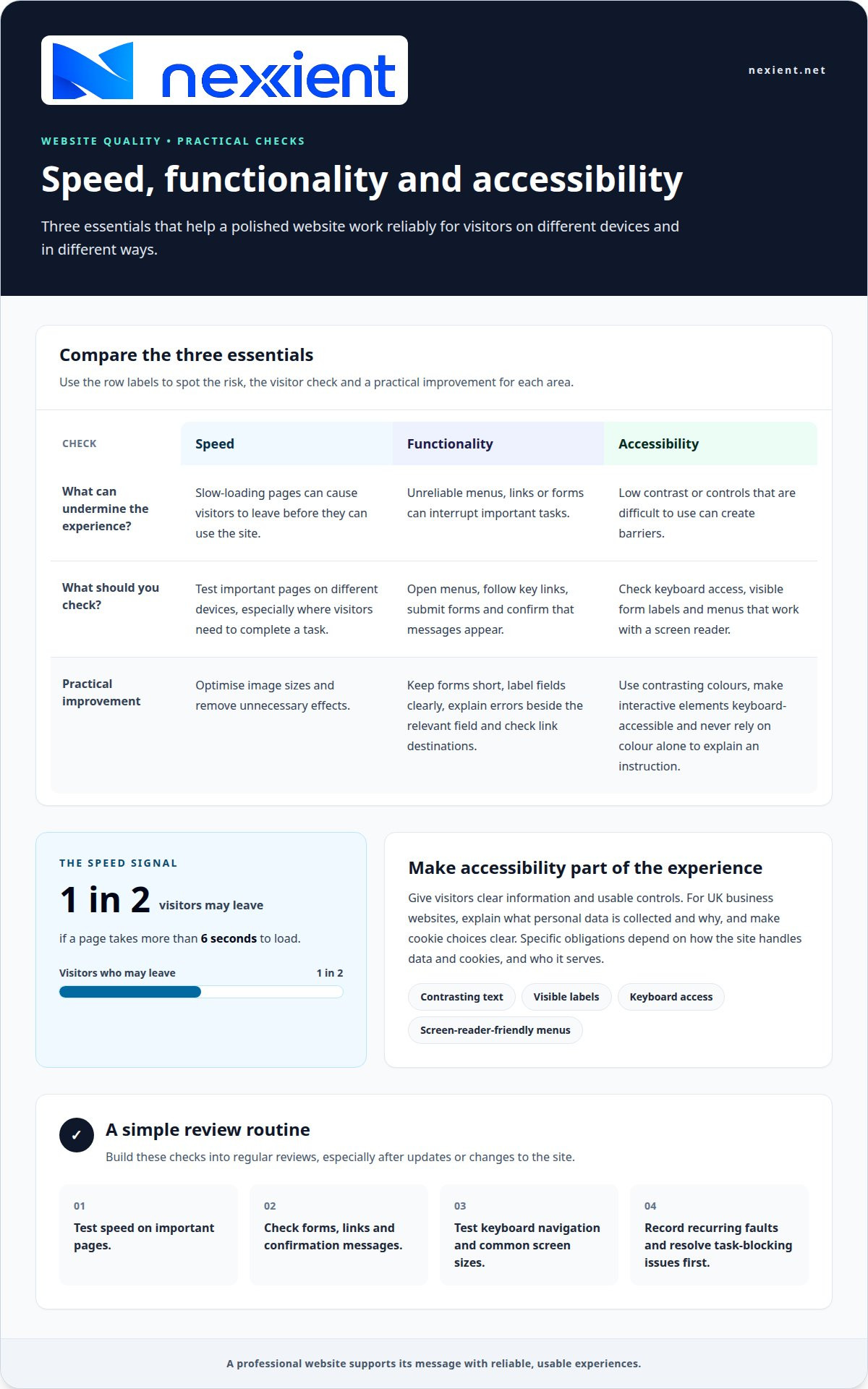
A slow or unreliable page can undermine an otherwise polished design. One in two website visitors will leave if a page takes more than 6 seconds to load. Optimise image sizes, remove unnecessary effects and test important pages on different devices. Prioritise pages where visitors need to complete an action, such as submitting an enquiry or checking out, and watch for delays during those tasks.
Test functionality as a visitor would. Open each menu, follow key links, submit forms and check that confirmation messages appear. Keep forms short, label each field clearly and explain errors beside the relevant element. These details help visitors complete tasks without losing focus or misunderstanding your message. Check, too, that links lead to the intended destinations rather than outdated pages.
Accessibility improves the experience for your whole audience. Use contrasting text and background colours, provide visible form labels and ensure interactive elements work with a keyboard. Make menus usable with a screen reader, software that reads page content aloud. Ensure buttons are easy to identify and that colour alone doesn’t communicate an instruction. These steps help people use the site in different ways.
For UK business websites, explain what personal data you collect and why, make cookie choices clear, and design accessible content and controls. Specific obligations depend on how the site handles data and cookies, and who it serves. Clear information and usable controls give visitors a practical way to understand and manage their experience.
Build these checks into regular reviews. Test speed, forms, links and keyboard navigation after changes, then check the live site on common screen sizes. Record recurring faults and resolve the ones that block important tasks first. A professional business website doesn’t just look finished; its functionality supports the message and helps visitors act confidently.
Nexient: Website Maintenance
Nexient’s Website Maintenance helps keep your website current, functional and consistent as it evolves. It’s a practical next step when pages need regular updates or changes to your content affect the visitor experience. Reviewing speed, links, forms and mobile layouts can help identify issues before they disrupt important tasks.
Maintenance also helps preserve the design standards established across your site. Consistent colours, page layouts and navigation make new content feel like part of the same experience. If your website needs ongoing attention to maintain its polish and usability, Website Maintenance can support that work.
Contact Nexient to discuss Website Maintenance for your website.
Build a stronger digital first impression
Your website can grow alongside your organisation. As your audience, services or priorities change, treat each update as a chance to make the experience clearer and more useful. What makes a website look professional over time isn’t a fixed visual style, but thoughtful choices that continue to serve visitors.
Nexient creates Business Websites, eCommerce Websites and Landing Pages, and provides Website Maintenance for existing sites. Whether you’re planning a new online presence or refining the one you have, choose a next step that fits your goals and gives visitors a clear path forward.
Start a conversation with Nexient about your website, and take the next step towards a digital experience that feels right for your organisation.
Frequently Asked Questions
What Makes a Website Look Professional?
A professional website feels deliberate because each page serves a clear purpose and reflects the business behind it. For example, a consultancy could explain a service, introduce the people delivering it and show a relevant project. What makes a website look professional is how these details build a credible picture of the organisation, rather than appearance alone.
What are the key elements of a professional-looking website?
Accurate business details, useful page content and clear evidence of expertise all contribute to a professional impression. A trades business, for instance, can explain its services, describe the areas it serves and share project examples. Keep opening hours, contact information and service descriptions current across the site. Conflicting or outdated details can make a business seem inattentive, even when the design is polished.
How does website layout and visual hierarchy affect professionalism?
Layout and visual hierarchy shape the order in which visitors notice and understand information. On a service page, lead with the customer outcome, follow with relevant evidence such as a project example, then provide details that support a decision. This creates a clear reading path and stops secondary information, such as company history, from competing with the main message.
What typography and colour choices make a website look professional?
Choose typefaces that are easy to read and suit the organisation’s character. A site generally needs no more than three typefaces; using fewer can make headings and body copy feel more unified. Select colours that support the brand’s personality, then apply them consistently to headings, links and buttons. Avoid decorative text styles that make important wording harder to scan.
How important are high-quality images and consistent branding on a website?
Images and branding help visitors connect an organisation’s identity with its work. Choose photographs that add specific context, such as a team member at work or a finished project, rather than using visuals simply to fill space. Consistent image framing and tone can make pages feel related. Use brand assets consistently so visitors recognise the organisation across its website.